The Anatomy of a Useful Link-in-Bio Page
Top to bottom, what a good bio page contains, the four questions that decide whether anything belongs on it, and how to tell what is working without click counts.
15 July 2026 · 8 min read · updated 10 October 2026
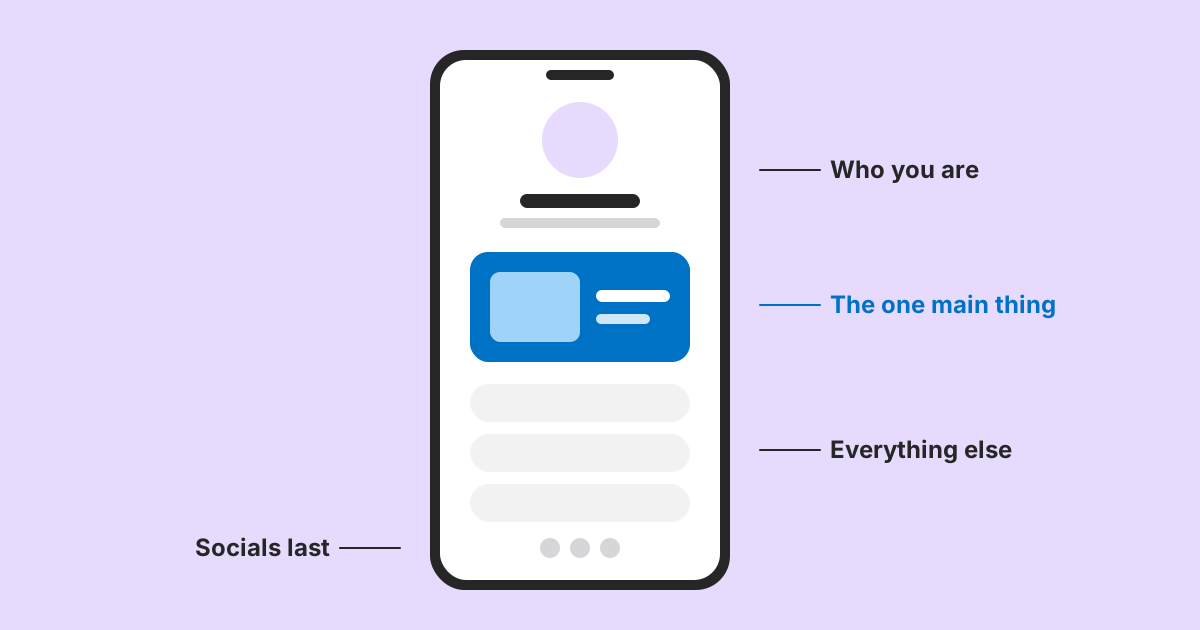
A bio page has one job, and it is narrower than most people assume. Somebody has just seen you somewhere else, tapped a link, and arrived with a question. The page either answers it in the next few seconds or they leave.
That framing does most of the work. It is not a website, not a portfolio and not a list of everywhere you exist. It is an answer to one question, asked by somebody standing on a train with one thumb free.
Start by naming who arrives
Most pages are built for an imaginary visitor who wants to know everything. Real visitors arrive from a specific place with a specific reason, and there are usually only two or three kinds.
A restaurant's page gets people who want to book, people checking whether it is open and people looking for the menu. A musician's gets people who just heard something and want more, plus people looking for tickets. A freelancer's gets potential clients checking availability and rates.
Write the two or three down. Everything after this is deciding whether a given element helps one of them.
The top: who you are, in one line
A name, a photo or mark, and a single line saying what you do. That is the whole introduction, and it should survive being read in about a second.
The common failure is a paragraph. Somebody who just arrived from a profile already has context, because they saw something of yours moments ago. They do not need a biography; they need confirmation that they are in the right place before they scroll.
Independent bakery in Sheffield. Sourdough, Wednesday to Sunday.
Welcome to our page! We are passionate about bringing you the very best in artisan baking, using traditional methods handed down over generations.
The first tells you what, where and when. The second takes four times as long to say less.
The primary action: one thing, unmistakably
Directly beneath the introduction goes the single thing most visitors want, given a visual treatment nothing else on the page has. On LinkMint that is what the featured link block is for: it can carry a description and an image, so it looks different from an ordinary link before anyone reads it.
Choosing it is the hard part, and the answer changes more often than the page does. Tickets during a tour, the new record afterwards. Bookings in December, the menu in February. The page should be edited whenever the answer changes, which is more often than most pages are.
The supporting section: grouped, labelled, short
Below that come the other things people came for, grouped under headings if there are more than about five.
Headings do two jobs. They turn a long undifferentiated list into several short ones, which people actually read to the end of. And they give somebody using a screen reader a way to move through the page rather than hearing eleven links in sequence.
Each item should say what it is rather than where it goes. Shop is a destination; Prints and posters, ships worldwide is an answer. A link block's description line is the place for that second half.
The part that isn't links at all
Plenty of what visitors want is information, not a destination, and forcing it into a button either creates a page containing one sentence or leaves it off entirely.
- Opening hours, which is often the most wanted fact and is frequently missing
- Prices, or a range, so people know before committing to find out
- Where you are, if you are anywhere physical
- The two or three questions that arrive as messages every week
- Anything that changes seasonally and is easier to state than to link to
LinkMint's bio pages have blocks for exactly these: text, FAQ, pricing, services, products and contact (email, phone, WhatsApp or a location). The FAQ block deserves particular attention. Every question it answers is a message somebody does not have to send and you do not have to reply to, and the ones worth including are already sitting in your inbox.
The bottom: contact and socials
A way to reach you, sized appropriately, and your social profiles. Social icons belong here rather than near the top. Somebody who arrived from Instagram does not need a link back to Instagram, and putting it above your actual content sends people back where they came from.
Four questions for anything you are considering adding
- Which of my two or three visitors wants this? If the answer is none of them, it is there for you rather than for them.
- Is it still true? Many pages carry something that expired months ago.
- Does it earn its position? Everything you keep pushes whatever is below it further out of sight.
- Would removing it be noticed? If not, that is the answer.
The most effective edit to a bio page is almost always removal. Links accumulate because adding is easy and nobody is responsible for taking anything away.
When one page cannot serve everybody
Sometimes the two or three visitors want genuinely incompatible things. A musician gets fans and promoters. A photographer gets people wanting prints and people wanting to hire them. Serving both from one page means the top of it is a compromise nobody asked for.
The usual instinct is to add more sections. The better answer is often more than one page: the profile link goes to the fan page, and the business page has its own address that you put in emails and on a card. Each page then gets a real primary action instead of two competing ones.
Each LinkMint bio page has its own private edit link, so if you make two, keep both edit links somewhere safe and label them clearly.
It has to be fast, and that constrains what goes on it
Bio pages are opened from inside social apps, on phones, on whatever connection is available, by people with very little invested in waiting. That is an unforgiving loading context, and it has a design consequence: every heavy element you add is paid for by everyone who visits, including the ones who leave before it appears.
- Images on LinkMint bio pages are shown from an https address you supply rather than uploaded, so the file at that address is exactly what visitors download. A photograph straight off a phone can be several megabytes; resize and compress it before you host it.
- An embedded YouTube or Vimeo player is much heavier than the thumbnail it shows.
- A gallery of nine images is nine downloads before the page settles.
- Every image needs a short description for people using screen readers, and for when the image fails to load.
None of these is forbidden. The point is that they are trade-offs rather than free additions, and a page with one well-compressed image will usually feel faster than one with six.
Because images are linked rather than uploaded, they also depend on wherever you host them. If that host removes the file or changes its address, the image disappears from your page. Use a host you control, such as your own website, where you can.
Judging what works without click counts
LinkMint bio pages record nothing: no page views, no clicks per block, no visitor details. That is deliberate, but it means you need other ways to decide what stays and what moves. There are several, and some are better than a click count would be.
Tag the links that go to your own site
For any link that points at a website you run, add UTM parameters with the UTM builder before pasting it into the block. Visits from the bio page then arrive in your own analytics with a label, and you can see which links people actually use.
Featured link: https://example.com/shop?utm_source=bio&utm_medium=social&utm_campaign=spring&utm_content=featured
Shop link lower down: https://example.com/shop?utm_source=bio&utm_medium=social&utm_campaign=spring&utm_content=list
utm_content is the parameter meant for telling apart two links that lead to the same place. If the lower link gets as many visits as the featured one, people are scrolling past the top to find it, which is a sign the order is wrong.
This only works for destinations whose analytics you can see. A link to a streaming service or someone else's ticket shop will not report back to you, and that is fine. Judge those by the next methods instead.
Read your inbox
The questions people send you are a direct record of what the page failed to answer. If three people this week asked whether you deliver, the answer belongs in a text or FAQ block, near the top.
Watch someone use it
Hand your phone to a friend, tell them they have just found you from your profile and want to book, and watch where their thumb goes. Five minutes of this finds problems no count would explain, such as a label nobody understands or a button they assume is decoration.
It is a page that goes stale
Unlike most of a website, a bio page is short enough that one out-of-date item is a large share of it. A link to an event that has already happened is not a small blemish on a five-item page; it is a fifth of what the visitor sees.
Reviewing it takes two minutes and is worth doing whenever the answer to "what do most people want right now" changes. Put a reminder in your calendar, keep the private edit link where you can find it, and run the four questions again. The edit link is the only way to change the page and cannot be recovered if it is lost, so a password manager is the right home for it.
A short checklist
- One line at the top saying what you do, where and when
- One featured link for the thing most people want this month
- Headings once there are more than about five links
- Labels that say what something is, not just where it goes
- Hours, prices and common questions as text, not as links
- Contact and socials at the bottom
- Images resized before hosting, each with a description
- UTM tags on links into your own site
- The edit link saved somewhere safe
The finished page is usually shorter than the first draft, says what things are rather than where they go, and answers the most common question before anybody has to tap anything.
Related reading
- Why Bio Pages Need Better Information Hierarchy
A stack of identical buttons works at three links and fails at eight. The problem is not the number of links; it is that nothing on the page says which one matters.
- UTM Parameters Explained Without the Marketing Jargon
Five labels you can add to a URL so your analytics can say where a visit came from. What each one means, which three matter most, and the small inconsistencies that quietly split your reports.
- QR Codes and Short Links Work Better Together
Encoding a short link instead of a long address gives you a coarser, easier code and a line of text people can type. Here is what that buys you, what it does not, and how to plan for a destination that might change.