Why Bio Pages Need Better Information Hierarchy
A stack of identical buttons works at three links and fails at eight. The problem is not the number of links; it is that nothing on the page says which one matters.
22 April 2026 · 8 min read · updated 10 October 2026
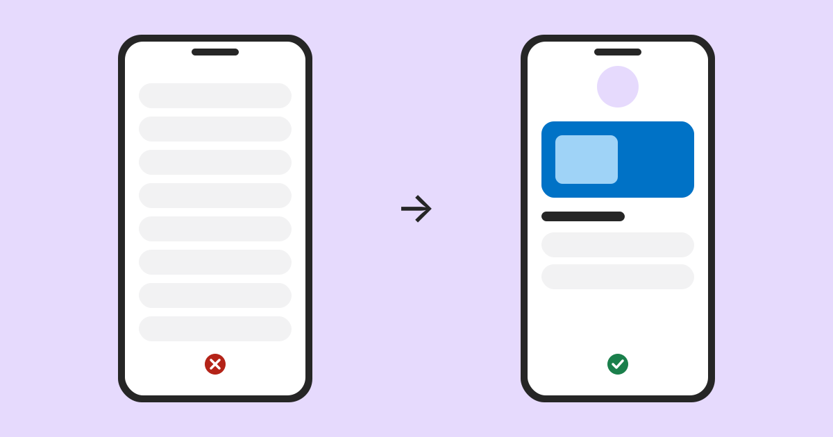
The standard bio page is a photo, a name and a vertical stack of identical buttons. It is the format everyone recognises, and for three links it is close to perfect: the visitor sees everything at once and picks.
At eight links the same design has quietly stopped working, and the reason is not that eight is too many. When everything looks identical, nothing indicates which one the visitor wants, so the page hands the whole decision to someone who arrived with a vague intention and very little patience.
Identical buttons are a design decision, not a neutral default
Visual weight is how a page signals importance before anyone reads a word. Size, contrast, position and whitespace are all taken in during the first glance and used to decide where to look.
A page where every element has the same weight has used that channel to say that everything is equally important, which is almost never true. Somebody visiting a musician's page during a tour wants tickets. Someone visiting a restaurant's page at seven in the evening wants to book. The page owner knows this and the page says nothing about it.
Three specific failures
The important link is fourth
Order accumulates historically. Links get added at the bottom as they come up, and the arrangement ends up reflecting when things happened rather than what matters now. The tour that ends next month sits below a merchandise link added eighteen months ago.
Everything below the fold is invisible
A phone shows a handful of buttons before the visitor has to scroll, and not everyone scrolls. A link in ninth position on an undifferentiated stack is, for a good share of visitors, simply not on the page.
Nothing explains what anything is
A button labelled Shop tells you less than it seems to. Shop for what: prints, clothing, tickets, a booking? A visitor who has to guess will often guess by not tapping at all.
What actually helps
One thing looks different
Pick the single most important link and give it a shape nothing else has: an image, more space, a different treatment. On LinkMint the featured link block does this, with room for a description and an image. It is the highest-value change available, and it costs one decision.
The discipline is that only one thing can be the exception. Two featured links is a stack of two, and the effect is gone.
Group with headings
Listen, Watch, Buy, Get in touch. Three or four headings turn eleven undifferentiated buttons into short lists, and a short list is something people read to the end of.
Headings also make the page navigable for someone using a screen reader, who can jump between sections instead of hearing eleven links in a row with no structure at all. Dividers and spacers help sighted visitors in the same way, by putting visible breaks between groups.
Say what the thing is
A line under a button costs nothing and removes the guessing. Shop becomes Prints and posters, ships worldwide. Book becomes Tables for up to six, usually available the same week.
Remove things
The most effective change is almost always deletion. A link that mattered last spring is now competing for attention with the one that matters today, and winning some of it.
A useful test: for each link, when did somebody last need this? If the answer is not recently, the page is better without it.
A worked example: before and after
Here is an illustrative page for a touring musician, as it tends to look after a couple of years of adding links at the bottom.
Latest video
Merch
Newsletter
Tour dates
Spotify
Apple Music
Bandcamp
Booking enquiries
Instagram
During a tour, most visitors want dates and tickets. On this page that is fourth, looks identical to the newsletter link above it, and gives no hint of which cities are coming up. Promoters looking for booking details have to scroll to eighth place. The Instagram link sends people back to where most of them came from.
Featured: Autumn tour, 12 UK dates, tickets on sale now
Heading: Listen
  Music player embed for the new single
  Links: Spotify, Apple Music, Bandcamp
Heading: Watch
  Video embed for the latest video
Heading: Shop
  Prints, shirts and vinyl, ships to the UK and EU
Heading: Bookings and press
  Contact block with the booking email
Social icons at the bottom
Nothing important was lost; the newsletter could go in the Shop group or come off entirely. What changed is that the page now has a shape: one thing at the top that answers the main question, and short labelled groups for everyone else.
Some things aren't links
The button stack has a second limitation: it can express only one kind of thing, which is go somewhere else. Plenty of what a visitor needs is not a destination.
Opening hours are not a link. Neither is a price, an address, a note about postage, or the answer to the question three people a week send a message about. Forcing those into buttons means either a button that leads to a page containing one sentence, or the information not being there at all.
- A text block answers what a visitor is wondering without them tapping anything
- A pricing block says what something costs before they commit to finding out
- An FAQ block absorbs the questions that currently arrive as messages
- A contact block offers email, phone, WhatsApp or a location in one tap
- An image or gallery shows the thing, which for anything visual beats describing it
Each of these creates hierarchy simply by not being a button. A page of eleven buttons has no shape. A page with a paragraph, three buttons, a price list and a couple of questions has one before anybody reads a word of it. LinkMint bio pages offer 17 block types for this reason, and the 40 starting layouts mix them rather than stacking links.
Design for the phone, because that is what this is
Bio pages are reached from social apps, which means they are read on phones, held in one hand, usually while doing something else. That is more demanding than a desktop browser and it changes what works.
Tap targets need to be comfortably large, with space between neighbours. Two buttons flush against each other produce mis-taps, and a mis-tap on a bio page more often ends with the visitor leaving than going back.
Long labels wrap onto two or three lines on a narrow screen, which breaks the rhythm of a list. Write labels short enough to survive a phone around 320 pixels wide, and put the detail in the description line.
Whatever matters most should be visible without scrolling, on a screen smaller than the one you are editing on. That constraint is what makes the removal advice concrete: everything you keep costs the thing below it its position.
Checking the order without click counts
LinkMint records nothing on bio pages: no views, no clicks, no visitor details. So the order has to be judged another way. These methods are often more useful than raw counts, because they tell you why as well as what.
Tag links into your own site
Where a block links to a website you run, build the address in the UTM builder before you paste it in. Use the same source and medium for every link on the page and vary utm_content by position.
| Block | utm_source | utm_medium | utm_content |
|---|---|---|---|
| Featured tour link | bio | social | featured-tour |
| Tour link in a lower group | bio | social | list-tour |
| Shop link | bio | social | list-shop |
Your own analytics will then show visits by utm_content. If a link low on the page brings as many visits as the featured one, people are scrolling past the top to reach it, and it probably belongs higher. Compare like with like: a week before you reorder and a week after, in similar conditions.
This only covers destinations whose analytics you can see. Links to streaming services, marketplaces or someone else's ticket shop will not report back to you.
Ask, and watch
Give your phone to someone who has not seen the page, name a task (find the next date in Leeds, book a table for four) and watch without helping. Hesitation over a label, a scroll past the answer, or a tap on something that is not a link tells you more than a percentage would.
Read the messages you get
Questions in your inbox are a record of what the page failed to answer or failed to put where people looked. If people keep asking for tour dates while the tour link is on the page, the link is in the wrong place or labelled badly.
A hierarchy checklist
- Exactly one featured item, chosen for what most visitors want this month
- The featured item visible without scrolling on a small phone
- Headings once there are more than about five links
- A description line on any link whose label could mean two things
- Hours, prices and common questions as text, not buttons
- Social icons and contact details at the bottom
- Nothing on the page that has expired
The page is a decision, not a directory
A bio page is not a list of everywhere you exist. It is an answer to the question a visitor arrived with, and most visitors arrive with one.
The most useful edit is usually not adding a block or changing a colour. It is deciding what the page is for this month, arranging it so that thing is unmistakable, and removing whatever else is competing with it. Keep the private edit link somewhere safe, because on LinkMint it is the only way back in to make that change.
Related reading
- The Anatomy of a Useful Link-in-Bio Page
Top to bottom, what a good bio page contains, the four questions that decide whether anything belongs on it, and how to tell what is working without click counts.
- UTM Parameters Explained Without the Marketing Jargon
Five labels you can add to a URL so your analytics can say where a visit came from. What each one means, which three matter most, and the small inconsistencies that quietly split your reports.
- Short Links Are More Than Fewer Characters
Shortening is the least interesting thing a short link does. A good one is readable, hard to mistype, permanent, checkable before you tap it and quiet about who follows it. Here is what that is worth, and what it deliberately leaves out.